pacman::p_load(
  ggstatsplot, tidyverse, readxl, performance, parameters, see, #For 4.1
  plotly, crosstalk, DT, ggdist, gganimate, #For 4.2
  FunnelPlotR,knitr #For 4.3
)Hands-on_Ex04
Visual Statistical Analysis
Load packages
Load Exam Data
exam <- read_csv('../data/Exam_data.csv')On-Sample Test
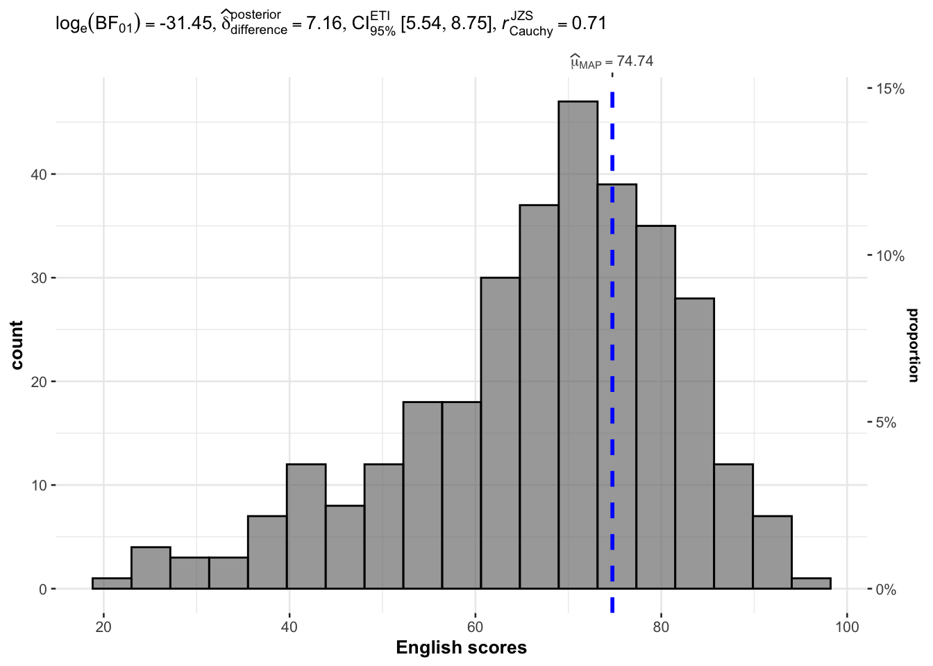
gghistostats with bayes on ENGLISH and test value 60
set.seed(1234)

gghistostats(
  data = exam,
  x = ENGLISH,
  type = "bayes",
  test.value = 60,
  xlab = "English scores"
)
Two-sample mean test
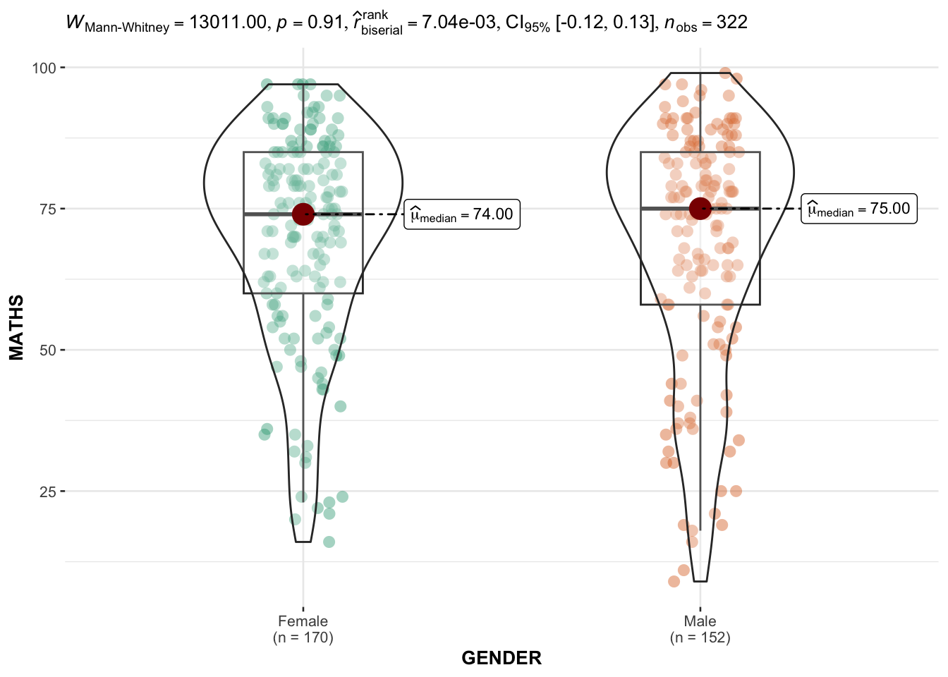
ggbetweenstats with GENDER AND MATHS and np
ggbetweenstats(
  data = exam,
  x = GENDER,
  y = MATHS,
  type = "np",
  message = FALSE
)
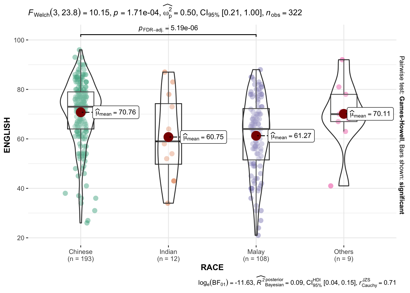
Oneway ANOVA Test
ggbetweenstats method on RACE and ENGLISH
ggbetweenstats(
  data = exam,
  x = RACE,
  y = ENGLISH,
  type = 'p',
  mean.ci = TRUE,
  pairwise_comparisons = TRUE,
  pairwise.display = "s",
  p.adjust.method = "fdr",
  messages = FALSE
)
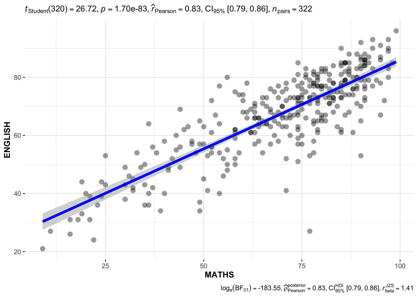
Significant Test of Correlation
ggscatterstats method on MATHS and ENGLISH
ggscatterstats(
  data = exam,
  x = MATHS,
  y = ENGLISH,
  marginal = FALSE
)
Significant Test of Association (Dependence)
Loading data with mutation
exam1 <- exam %>%
  mutate(MATHS_bins = cut(MATHS, breaks = c(0, 60, 75, 85, 100)))
ggbarstats
ggbarstats(exam1, x = MATHS_bins, y = GENDER)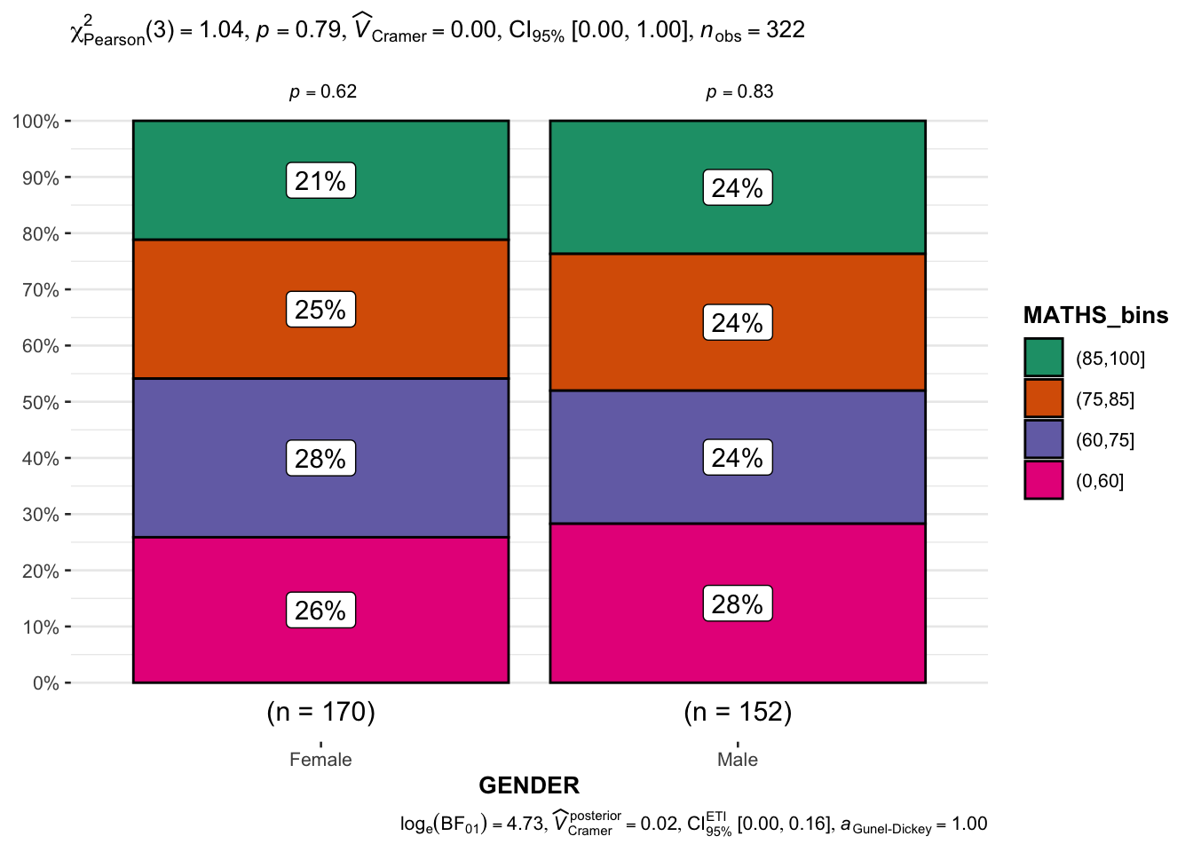
Visualising Models
Loading car_resale data
car_resale <- read_xls("../data/ToyotaCorolla.xls", "data")
car_resale
# A tibble: 1,436 × 38
Id Model Price Age_0…¹ Mfg_M…² Mfg_Y…³ KM Quart…⁴ Weight Guara…⁵
<dbl> <chr> <dbl> <dbl> <dbl> <dbl> <dbl> <dbl> <dbl> <dbl>
1 81 TOYOTA Cor… 18950 25 8 2002 20019 100 1180 3
2 1 TOYOTA Cor… 13500 23 10 2002 46986 210 1165 3
3 2 TOYOTA Cor… 13750 23 10 2002 72937 210 1165 3
4 3 TOYOTA Co… 13950 24 9 2002 41711 210 1165 3
5 4 TOYOTA Cor… 14950 26 7 2002 48000 210 1165 3
6 5 TOYOTA Cor… 13750 30 3 2002 38500 210 1170 3
7 6 TOYOTA Cor… 12950 32 1 2002 61000 210 1170 3
8 7 TOYOTA Co… 16900 27 6 2002 94612 210 1245 3
9 8 TOYOTA Cor… 18600 30 3 2002 75889 210 1245 3
10 44 TOYOTA Cor… 16950 27 6 2002 110404 234 1255 3
# … with 1,426 more rows, 28 more variables: HP_Bin <chr>, CC_bin <chr>,
# Doors <dbl>, Gears <dbl>, Cylinders <dbl>, Fuel_Type <chr>, Color <chr>,
# Met_Color <dbl>, Automatic <dbl>, Mfr_Guarantee <dbl>,
# BOVAG_Guarantee <dbl>, ABS <dbl>, Airbag_1 <dbl>, Airbag_2 <dbl>,
# Airco <dbl>, Automatic_airco <dbl>, Boardcomputer <dbl>, CD_Player <dbl>,
# Central_Lock <dbl>, Powered_Windows <dbl>, Power_Steering <dbl>,
# Radio <dbl>, Mistlamps <dbl>, Sport_Model <dbl>, Backseat_Divider <dbl>, …Multiple Regression Model using lm
model <- lm(Price ~ Age_08_04 + Mfg_Year + KM + Weight + Guarantee_Period, data = car_resale)
model
Call:
lm(formula = Price ~ Age_08_04 + Mfg_Year + KM + Weight + Guarantee_Period,
    data = car_resale)

Coefficients:
     (Intercept)         Age_08_04          Mfg_Year                KM
      -2.637e+06        -1.409e+01         1.315e+03        -2.323e-02
          Weight  Guarantee_Period
       1.903e+01         2.770e+01
Model Diagnostic: checking for multicolonearity
check_c <- check_collinearity(model)
plot(check_c)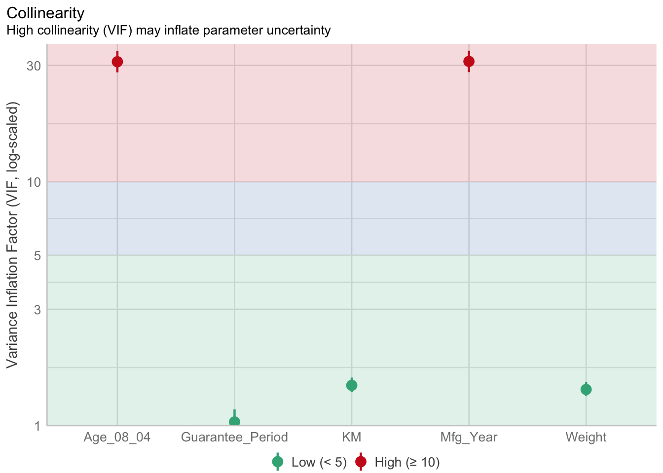
Model Diagnostic: checking for normality assumption
model1 <- lm(Price ~ Age_08_04 + KM + Weight + Guarantee_Period, data = car_resale)
check_n <- check_normality(model1)
plot(check_n)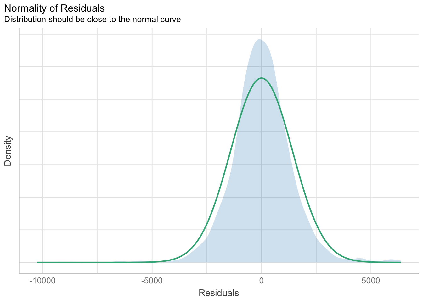
Model Diagnostic: Check model for homogeneity of variances
check_h <- check_heteroscedasticity(model1)
plot(check_h)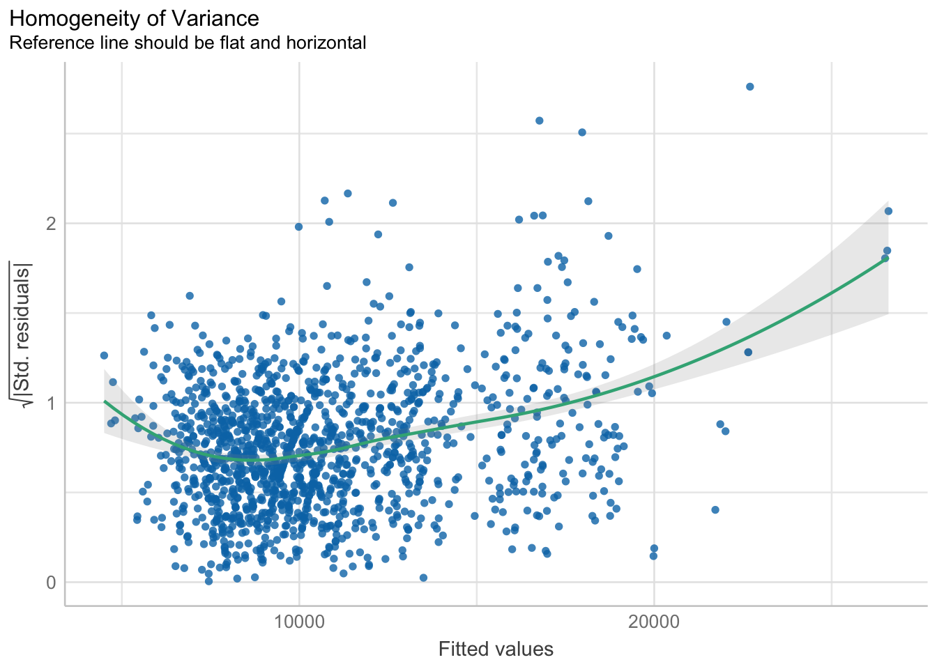
Model Diagnostic: Complete check
check_model(model1)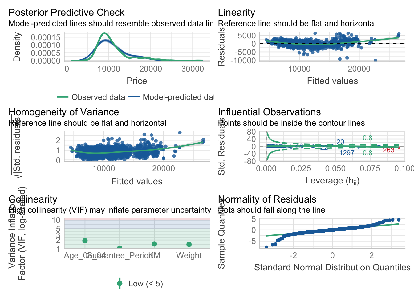
Visualising Regression Parameters using see methods
plot(parameters(model1))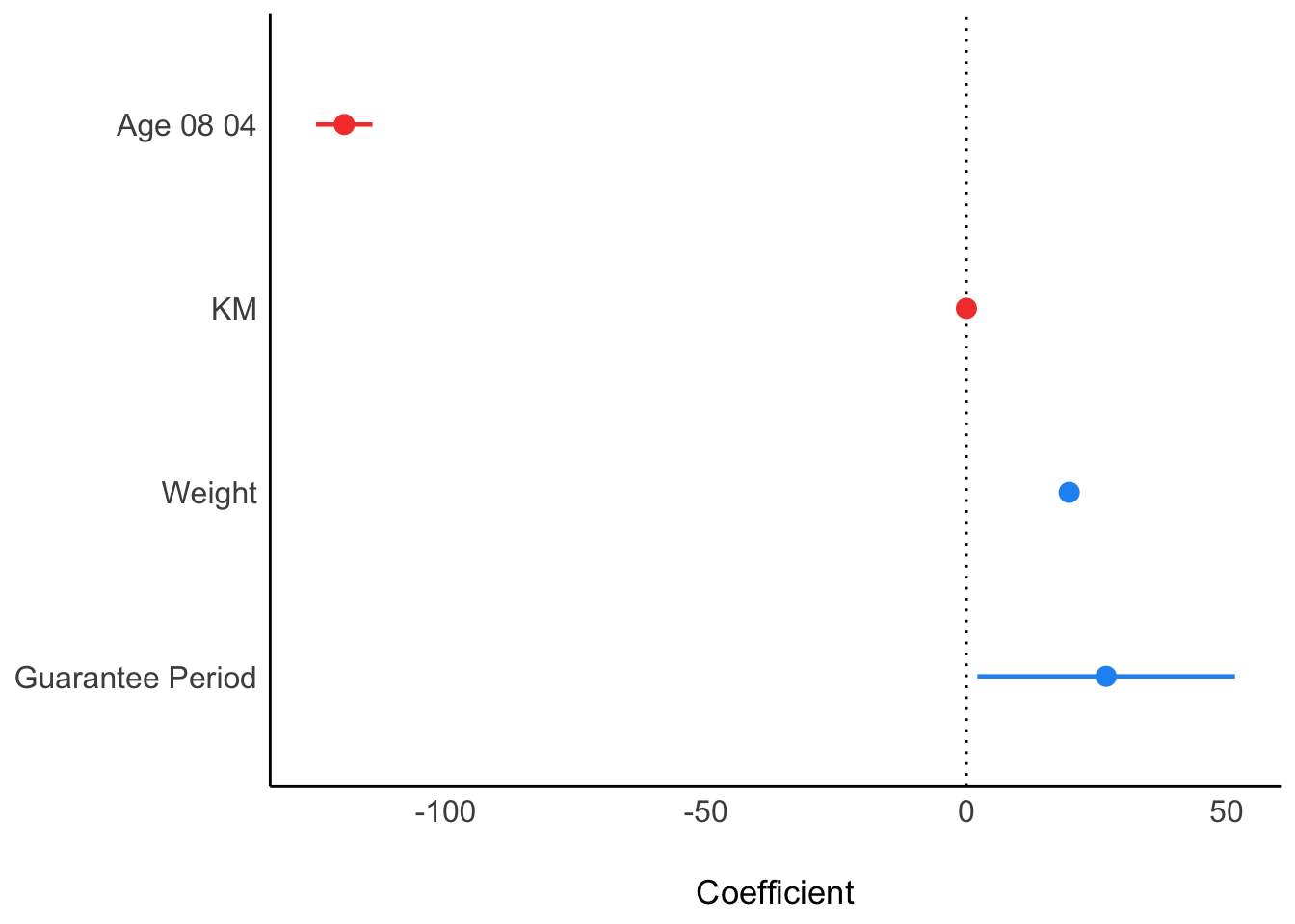
Visualising Regression Parameters using ggcoefstats
ggcoefstats(model1, output="plot")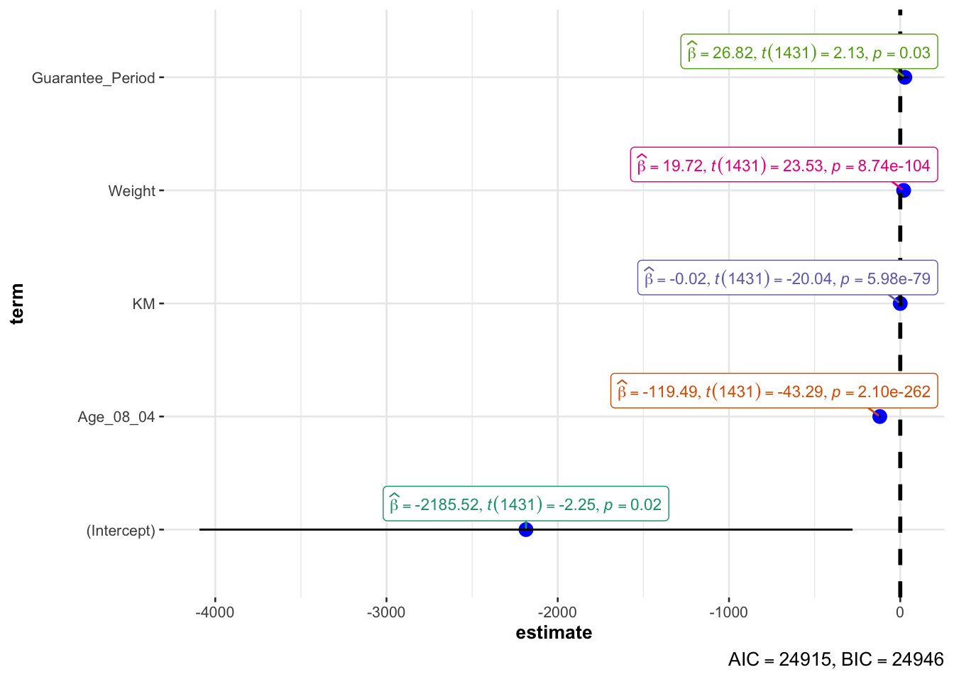
Visualising Uncertainty
my_sum <- exam %>%
  group_by(RACE) %>%
  summarise(
    n=n(),
    mean = mean(MATHS),
    sd = sd(MATHS)
  ) %>%
mutate(se = sd/sqrt(n-1))knitr::kable(head(my_sum), format = 'html')| RACE | n | mean | sd | se |
|---|---|---|---|---|
| Chinese | 193 | 76.50777 | 15.69040 | 1.132357 |
| Indian | 12 | 60.66667 | 23.35237 | 7.041005 |
| Malay | 108 | 57.44444 | 21.13478 | 2.043177 |
| Others | 9 | 69.66667 | 10.72381 | 3.791438 |
ggplot(my_sum) + geom_errorbar(
  aes(x = RACE, ymin = n-mean, ymax = n+mean),
  width = 0.2,
  colour = "black",
  alpha = 0.9,
  size = 0.35
) +
  geom_point(aes(x=RACE, y=mean), stat="identity", color="red", size=1.5, alpha=1) +
  ggtitle("Standard error of mean maths score by race")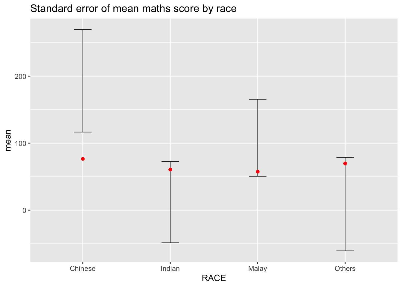
ggplot(my_sum) + geom_errorbar(
  aes(x = reorder(RACE, -mean), ymin = mean-1.96*(sd/sqrt(n)), ymax = mean+1.96*(sd/sqrt(n))),
  width = 0.2,
  colour = "black",
  alpha = 0.9,
  size = 0.35
) +
  geom_point(aes(x=RACE, y=mean), stat="identity", color="red", size=1.5, alpha=1) +
  ggtitle("95% confidence interval of mean maths score by race")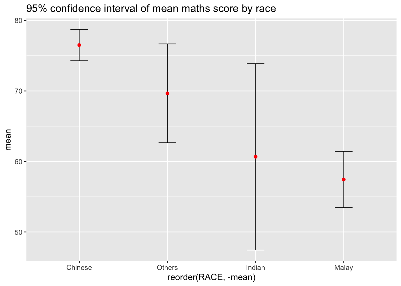
d <- highlight_key(my_sum)
p <- ggplot(d) + geom_errorbar(
  aes(x = reorder(RACE, -mean), ymin = mean-2.58*(sd/sqrt(n)), ymax = mean+2.58*(sd/sqrt(n))),
  width = 0.2,
  colour = "black",
  alpha = 0.9,
  size = 0.35
) +
  geom_point(aes(x=RACE, y=mean), stat="identity", color="red", size=1.5, alpha=1) +
  ggtitle("99% confidence interval of mean maths score by race")

gg <- highlight(ggplotly(p), "plotly_selected")

crosstalk::bscols(gg, DT::datatable(d), widths = 5)
exam %>%
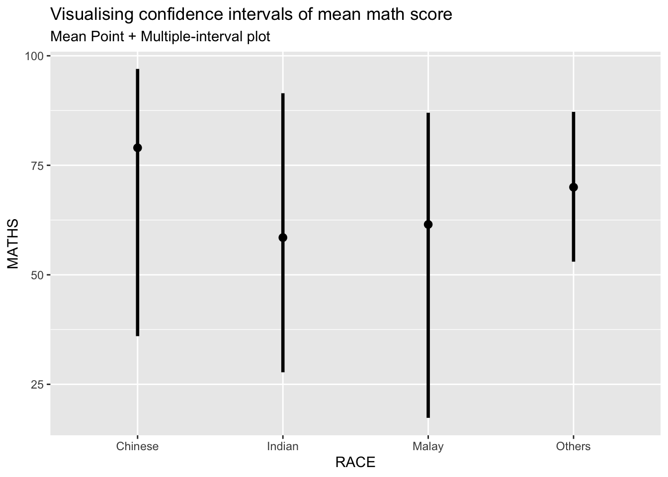
ggplot(aes(x = RACE, y = MATHS)) +
stat_pointinterval(.width = 0.95, .point=median, .interval=qi) +
labs(
title = "Visualising confidence intervals of mean math score",
subtitle = "Mean Point + Multiple-interval plot"
)
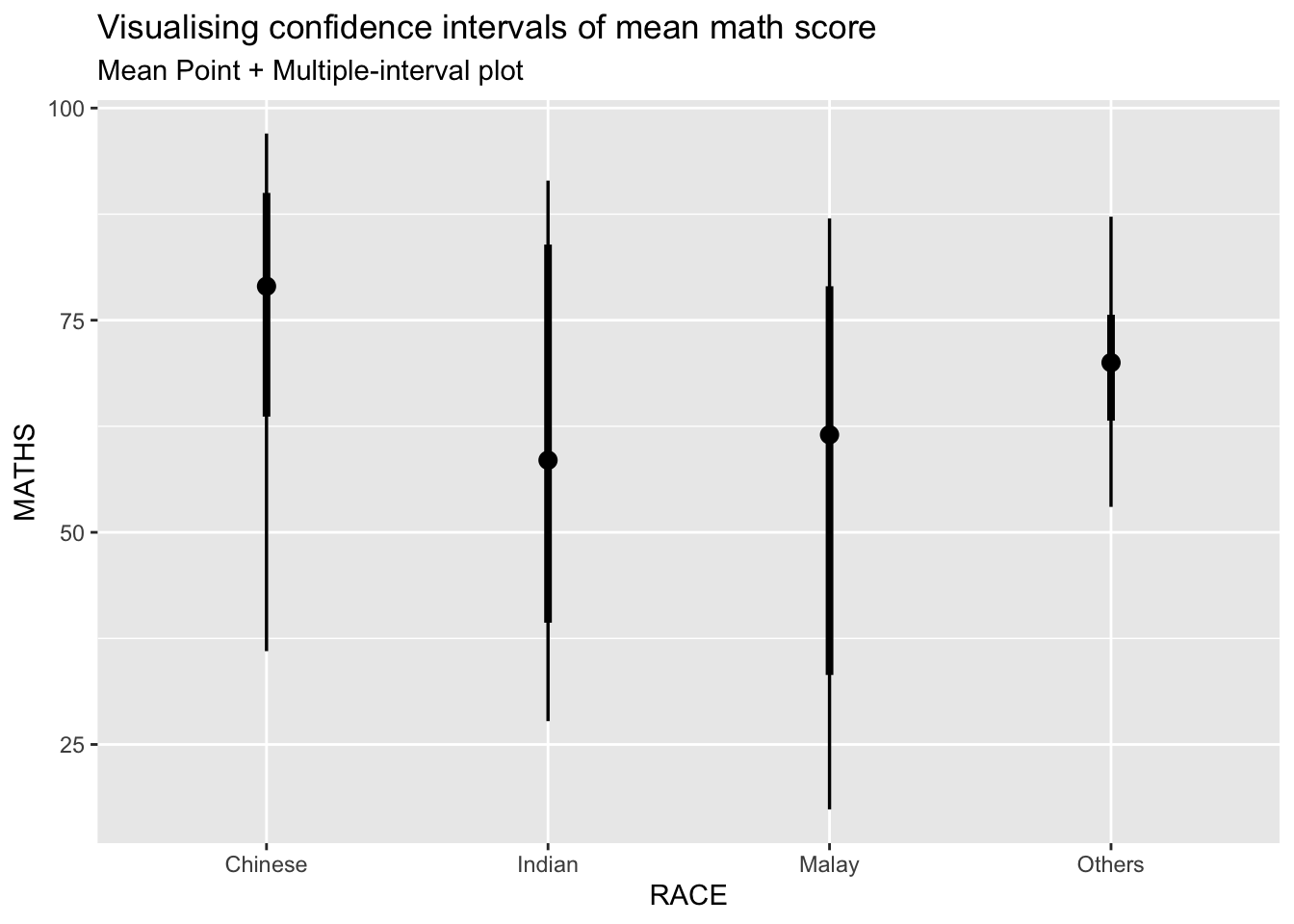
exam %>%
  ggplot(aes(x = RACE, y = MATHS)) +
  stat_pointinterval(show.legend = FALSE) +
  labs(
    title = "Visualising confidence intervals of mean math score",
    subtitle = "Mean Point + Multiple-interval plot"
  )
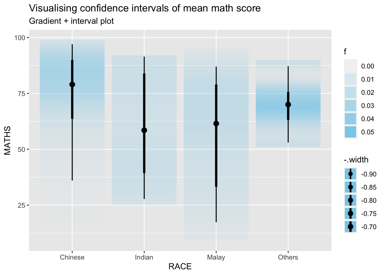
exam %>%
  ggplot(aes(x = RACE, y = MATHS)) +
  stat_gradientinterval(fill = "skyblue", show.legend = TRUE) +
  labs(
    title = "Visualising confidence intervals of mean math score",
    subtitle = "Gradient + interval plot"
  )
devtools::install_github("wilkelab/ungeviz")strapgod (NA -> ea2b1ecfc...) [GitHub]
── R CMD build ─────────────────────────────────────────────────────────────────
* checking for file ‘/private/var/folders/ww/j00nhnk94cj6ylcjzs1rcx9c0000gn/T/RtmpOC6JUA/remotes13edf10e07a69/DavisVaughan-strapgod-ea2b1ec/DESCRIPTION’ ... OK
* preparing ‘strapgod’:
* checking DESCRIPTION meta-information ... OK
* checking for LF line-endings in source and make files and shell scripts
* checking for empty or unneeded directories
Omitted ‘LazyData’ from DESCRIPTION
* building ‘strapgod_0.0.4.9000.tar.gz’
── R CMD build ─────────────────────────────────────────────────────────────────
* checking for file ‘/private/var/folders/ww/j00nhnk94cj6ylcjzs1rcx9c0000gn/T/RtmpOC6JUA/remotes13edf7bb4d6f1/wilkelab-ungeviz-aeae12b/DESCRIPTION’ ... OK
* preparing ‘ungeviz’:
* checking DESCRIPTION meta-information ... OK
* checking for LF line-endings in source and make files and shell scripts
* checking for empty or unneeded directories
* building ‘ungeviz_0.1.0.tar.gz’library(ungeviz)ggplot(data = exam, aes(x = factor(RACE), y = MATHS)) +
geom_point(position = position_jitter(
height = 0.3, width = 0.05
),
size = 0.4, color = '#0072B2', alpha = 1/2) +
geom_hpline(data = sampler(25, group = RACE), height = 0.6, color = "#D55E00") +
theme_bw() + transition_states(.draw, 1,3)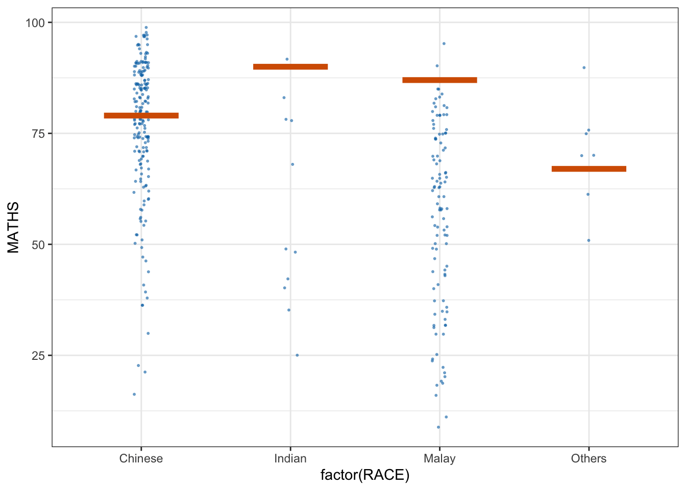
ggplot(data = exam,
       (aes(x = factor(RACE),
            y = MATHS))) +
  geom_point(position = position_jitter(
    height = 0.3,
    width = 0.05),
    size = 0.4,
    color = "#0072B2",
    alpha = 1/2) +
  geom_hpline(data = sampler(25,
                             group = RACE),
              height = 0.6,
              color = "#D55E00") +
  theme_bw() +
  transition_states(.draw, 1, 3)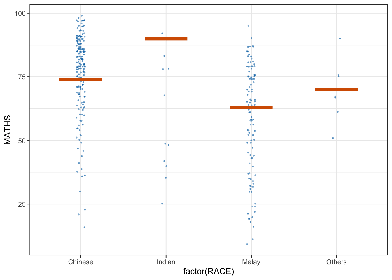
Building Funnel Plot with R
covid19 <- read_csv("../data/COVID-19_DKI_Jakarta.csv") %>%
mutate_if(is.character, as.factor)funnel_plot(
numerator = covid19$Positive,
denominator = covid19$Death,
group = covid19$'Sub-district'
)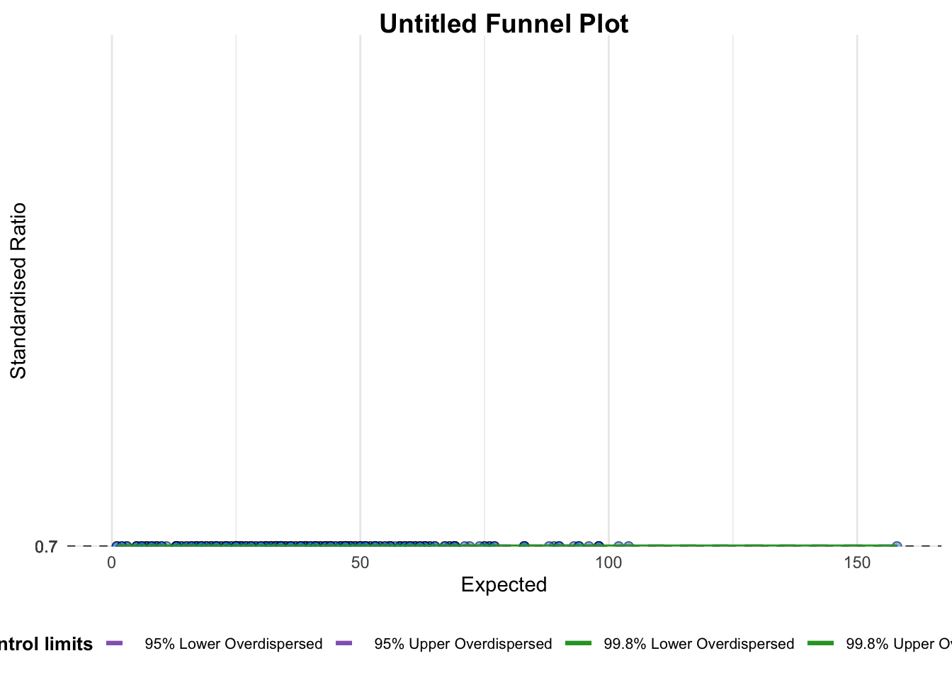
A funnel plot object with 267 points of which 0 are outliers.
Plot is adjusted for overdispersion. funnel_plot(
numerator = covid19$Death,
denominator = covid19$Positive,
group = covid19$`Sub-district`,
data_type = "PR",
xrange = c(0,6500),
yrange = c(0,0.05)
)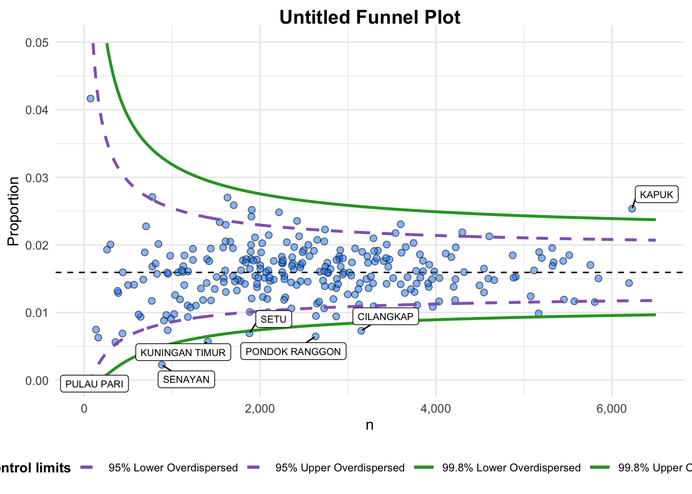
A funnel plot object with 267 points of which 7 are outliers.
Plot is adjusted for overdispersion. funnel_plot(
numerator = covid19$Death,
denominator = covid19$Positive,
group = covid19$`Sub-district`,
data_type = "PR",
xrange = c(0, 6500),
yrange = c(0, 0.05),
label = NA,
title = "Cumulative COVID-19 Fatality Rate by Cumulative Total Number of COVID-19 Positive Cases", #<<
x_label = "Cumulative COVID-19 Positive Cases", #<<
y_label = "Cumulative Fatality Rate" #<<
)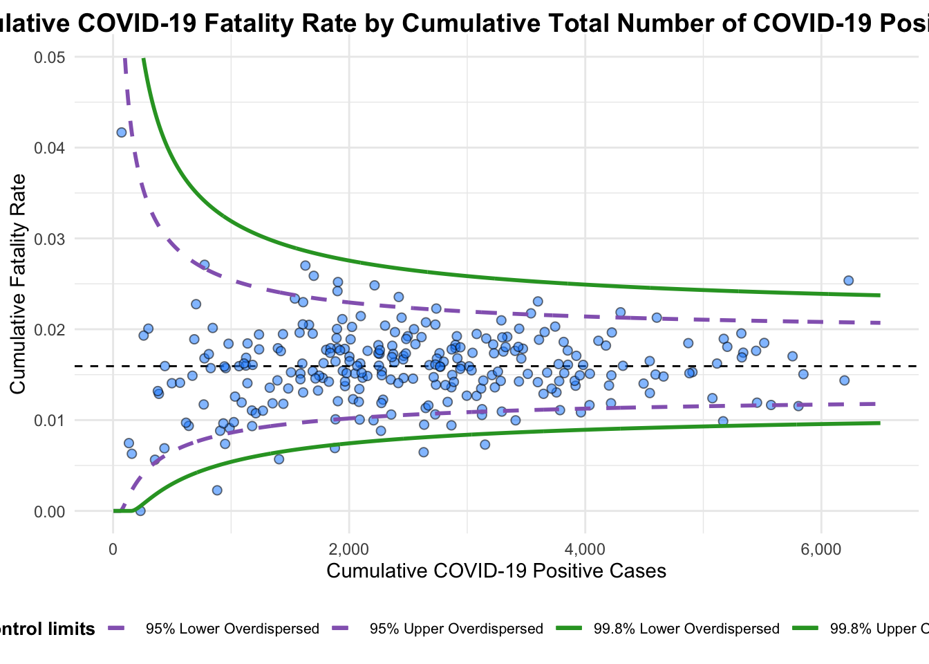
A funnel plot object with 267 points of which 7 are outliers.
Plot is adjusted for overdispersion.
df <- covid19 %>%
mutate(rate = Death / Positive) %>%
mutate(rate.se = sqrt((rate*(1-rate)) / (Positive))) %>%
filter(rate > 0)fit.mean <- weighted.mean(df$rate, 1/df$rate.se^2)number.seq <- seq(1, max(df$Positive), 1)
number.ll95 <- fit.mean - 1.96 * sqrt((fit.mean*(1-fit.mean)) / (number.seq))
number.ul95 <- fit.mean + 1.96 * sqrt((fit.mean*(1-fit.mean)) / (number.seq))
number.ll999 <- fit.mean - 3.29 * sqrt((fit.mean*(1-fit.mean)) / (number.seq))
number.ul999 <- fit.mean + 3.29 * sqrt((fit.mean*(1-fit.mean)) / (number.seq))
dfCI <- data.frame(number.ll95, number.ul95, number.ll999, number.ul999, number.seq, fit.mean)p <- ggplot(df, aes(x = Positive, y = rate)) +
geom_point(aes(label=`Sub-district`),
alpha=0.4) +
geom_line(data = dfCI,
aes(x = number.seq,
y = number.ll95),
size = 0.4,
colour = "grey40",
linetype = "dashed") +
geom_line(data = dfCI,
aes(x = number.seq,
y = number.ul95),
size = 0.4,
colour = "grey40",
linetype = "dashed") +
geom_line(data = dfCI,
aes(x = number.seq,
y = number.ll999),
size = 0.4,
colour = "grey40") +
geom_line(data = dfCI,
aes(x = number.seq,
y = number.ul999),
size = 0.4,
colour = "grey40") +
geom_hline(data = dfCI,
aes(yintercept = fit.mean),
size = 0.4,
colour = "grey40") +
coord_cartesian(ylim=c(0,0.05)) +
annotate("text", x = 1, y = -0.13, label = "95%", size = 3, colour = "grey40") +
annotate("text", x = 4.5, y = -0.18, label = "99%", size = 3, colour = "grey40") +
ggtitle("Cumulative Fatality Rate by Cumulative Number of COVID-19 Cases") +
xlab("Cumulative Number of COVID-19 Cases") +
ylab("Cumulative Fatality Rate") +
theme_light() +
theme(plot.title = element_text(size=12),
legend.position = c(0.91,0.85),
legend.title = element_text(size=7),
legend.text = element_text(size=7),
legend.background = element_rect(colour = "grey60", linetype = "dotted"),
legend.key.height = unit(0.3, "cm"))
p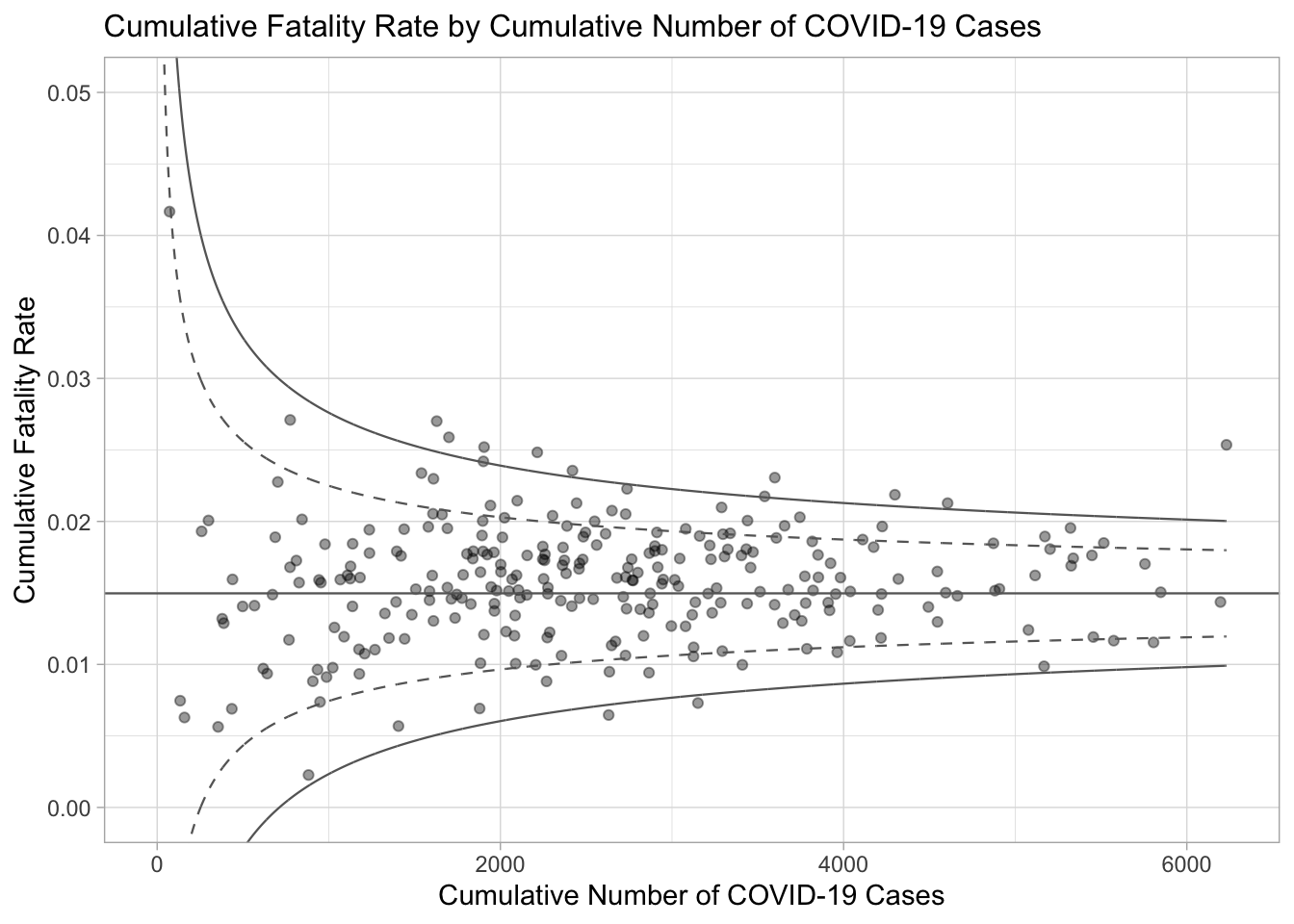
fp_ggplotly <- ggplotly(p,
  tooltip = c("label",
              "x",
              "y"))
fp_ggplotly